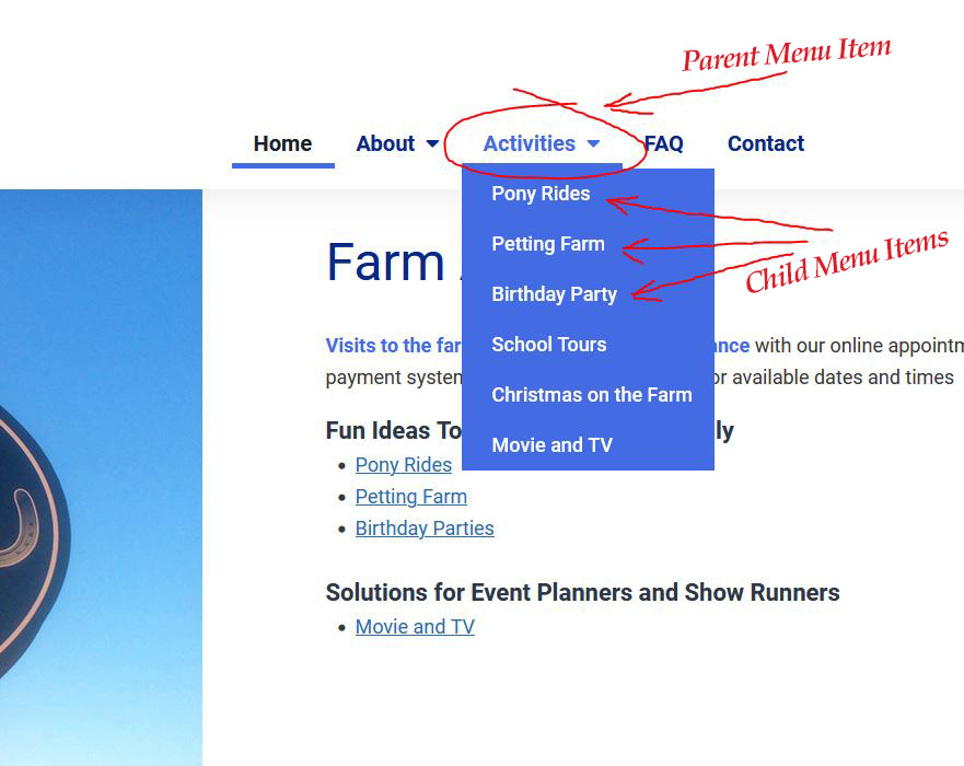
In the digital realm, a website’s navigation menu is akin to a roadmap guiding visitors through the site’s landscape. This tool is not just a feature; it’s a crucial element that can significantly enhance the user experience, making it straightforward for users to find what they’re looking for. Understanding the correct use of a navigation menu, especially in the header of a webpage, is fundamental for web developers and designers aiming to create user-friendly and efficient websites.
What is a Navigation Menu?
A navigation menu is a collection of links displayed on a website to help users navigate the site’s content. It’s typically placed in the website’s header, making it visible on every page to provide easy access to the site’s main sections. Depending on the design and layout of the website, navigation menus can be horizontal or vertical.
The Golden Rule: No Dead Links at the Parent Level
One of the cardinal rules in designing navigation menus is ensuring that parent menu items always link to a content page. A parent item acts as an umbrella, grouping similar topics, categories, or post types under it. It’s crucial that this parent item is not a dead link but leads to a page that provides value and context to the user. This approach not only improves the user experience but also aids in website organization, making it easier for visitors to understand the structure and flow of the site.

Why Parent Items Must Link to Content
- User Expectation: When users click on a menu item, they expect to be taken to a page that provides information or options related to what they clicked on. A dead link breaks this flow and can lead to frustration.
- SEO Benefits: Search engines favour websites that have a clear structure and easy navigation. Linking parent items to content pages helps search engines understand the website better, potentially improving its ranking.
- Enhanced Accessibility: For users who rely on screen readers and other assistive technologies, having every menu item lead to a content page ensures they can navigate the website effectively.
Solutions for Parent Page Content
When designing a website, it’s essential to plan the content which will be included on the pages linked from parent menu items. Here are three effective solutions:
- Overview Page: Create an overview or introduction page for the parent menu item. This page can summarize the topics or categories under it, providing links or references to the child items. It’s an excellent way to give context to the user about what they will find in the subsections.
- Featured Content: Use the parent page to feature highlights or important content from the child pages. This could include top articles, key products, or essential services that fall under the parent category. It serves as a teaser that encourages deeper exploration.
- Aggregated Content: For parent items that group similar topics or categories, consider an aggregated view of content from the child items. This could be a compilation of recent posts, a gallery of products, or a list of services. It provides a snapshot of what’s available in the subsections and can be dynamically updated to reflect the most current content.
Conclusion
A well-designed navigation menu is a cornerstone of effective web design and is crucial for enhancing the user experience and website usability. By ensuring that parent menu items always link to content pages and thoughtfully planning the content of those pages, web developers and designers can create more engaging, accessible, and user-friendly websites. Remember, the goal is to guide your visitors smoothly through your site, making their journey not just a destination but a delightful exploration.

